Font Research
A title to a film is the introduction before the opening that introduces things like director, casting director, producer, sound and tech etc.
Below are some examples from films.
Below are some examples from films.
|
simiplistic
|
the title being BAM
|
not simplistic
|
Title Font Research
My group decided our title opening will be a recording of the computer screen. The names of the director, producer etc will be shown on images that people have posted on news feed of Facebook. Then when the letters come out of the letter box as part of the opening the last letter will have the title of the film on it - 'Tagged'.
Below are some examples of fonts we could use for our title.
Below are some examples of fonts we could use for our title.

|

|

|
I chose a typing style font because when the titles come up they will be on an internet site - Facebook. I think that it would look effective because it will look like the titles have been typed.
Another idea I had was to have the font a little bit spooky but as the sub-genre is Yurei have the font chinese like. Below our some examples of spooky chinese fonts.
Another idea I had was to have the font a little bit spooky but as the sub-genre is Yurei have the font chinese like. Below our some examples of spooky chinese fonts.
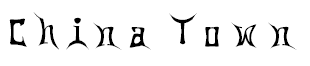
|

|
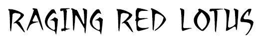
|
The Font I Chose
After discussing with my group what font to use, we decided that a simple font would be better, as it wouldn't draw the audience's attention away from the action. After watching many film openings and focusing on their font style I think that there is too much going on when the font is very stylised. The font we used was called 'Calibri'.